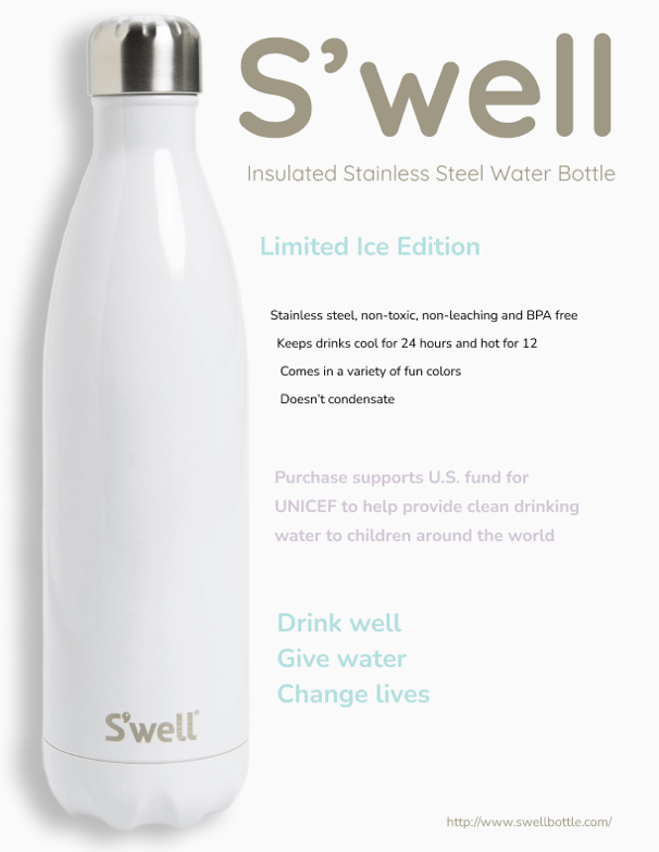
Design Philosophy: S'well Bottle Limited Ice Edition
The S'well poster embodies minimalist elegance through thoughtful visual hierarchy and purposeful negative space. The design approach centers on three core principles:
Pure Visual Simplicity
The clean white background mirrors the bottle's frost-like "Ice Edition" finish, creating immediate product recognition while establishing a sense of clarity and purity. This intentional use of white space allows the bottle's elegant silhouette to command attention without distraction.
Strategic Color Psychology
The color palette employs soft neutrals (taupe logo) with subtle mint accents for key messaging, evoking feelings of refreshment and environmental consciousness. This deliberate restraint in color usage reinforces the premium positioning while enhancing readability.
Purposeful Typographic Flow
Information architecture guides the viewer through a logical journey: from product identity (bold S'well logo), to practical benefits (central bullet points), culminating in emotional impact (mission statement). Text size and opacity create visual hierarchy, with mission-focused messaging in lighter weight to suggest elevated purpose beyond mere function.
Prototyping